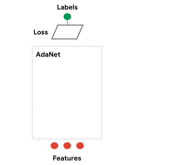
 https://github.com/tensorflow/adanet
6. TPOT— An automated Python machine learning tool that optimizes machine learning pipelines using genetic programming.
 https://github.com/EpistasisLab/tpot
Previously I talked about Auto-Keras, a great library for AutoML in the Pythonic world. Well, I have another very interesting tool for that.
The name is TPOT (Tree-based Pipeline Optimization Tool), and it’s an amazing library. It’s basically a Python automated machine learning tool that optimizes machine learning pipelines using genetic programming .
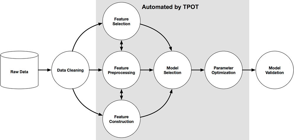
TPOT can automate a lot of stuff life feature selection, model selection, feature construction, and much more. Luckily, if you’re a Python machine learner, TPOT is built on top of Scikit-learn, so all of the code it generates should look familiar.
What it does is automate the most tedious parts of machine learning by intelligently exploring thousands of possible pipelines to find the best one for your data, and then it provides you with the Python code for the best pipeline it found so you can tinker with the pipeline from there.
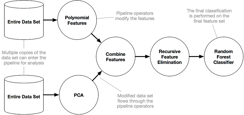
This is how it works:
For more details you can read theses great article by Matthew Mayo :
Thus far in this series of posts we have: This post will take a different approach to constructing pipelines. Certainly… www.kdnuggets.com
and Randy Olson :
By Randy Olson, University of Pennsylvania. Machine learning is often touted as: A field of study that gives computers… www.kdnuggets.com
Installation
You actually need to follow some instructions before installing TPOT. Here they are:
Optionally, you can install XGBoost if you would like TPOT to use the eXtreme Gradient Boosting models. XGBoost is… epistasislab.github.io
After that you can just run:
pip install tpot
Examples:
First let’s start with the basic Iris dataset:
So here we built a very basic TPOT pipeline that will try to look for the best ML pipeline to predict the
iris.target
.
And then we save that pipeline. After that, what we have to do is very simple — load the
.py
file you generated and you’ll see:
import numpy as np
from  sklearn.kernel_approximation  import RBFSampler
 from  sklearn.model_selection  import train_test_split
 from  sklearn.pipeline  import make_pipeline
 from  sklearn.tree  import DecisionTreeClassifier
# NOTE: Make sure that the class is labeled 'class' in the data file


tpot_data = np.recfromcsv('PATH/TO/DATA/FILE', delimiter='COLUMN_SEPARATOR', dtype=np.float64)

features = np.delete(tpot_data.view(np.float64).reshape(tpot_data.size, -1), tpot_data.dtype.names.index('class'), axis=1)

training_features, testing_features, training_classes, testing_classes = \

    train_test_split(features, tpot_data['class'], random_state=42)
exported_pipeline = make_pipeline(

    RBFSampler(gamma=0.8500000000000001),

    DecisionTreeClassifier(criterion="entropy", max_depth=3, min_samples_leaf=4, min_samples_split=9)

)
exported_pipeline.fit(training_features, training_classes)

results = exported_pipeline.predict(testing_features)
And that’s it. You built a classifier for the Iris dataset in a simple but powerful way.
Let’s go the MNIST dataset now:
As you can see, we did the same! Let’s load the
.py
file you generated again and you’ll see:
import

 numpy

 as

 np
from

 sklearn.model_selection

 import
 train_test_split


from

 sklearn.neighbors

 import
 KNeighborsClassifier
# NOTE: Make sure that the class is labeled 'class' in the data file


tpot_data = np.recfromcsv('PATH/TO/DATA/FILE', delimiter='COLUMN_SEPARATOR', dtype=np.float64)

features = np.delete(tpot_data.view(np.float64).reshape(tpot_data.size, -1), tpot_data.dtype.names.index('class'), axis=1)

training_features, testing_features, training_classes, testing_classes = \

    train_test_split(features, tpot_data['class'], random_state=42)
exported_pipeline = KNeighborsClassifier(n_neighbors=4, p=2, weights="distance")
exported_pipeline.fit(training_features, training_classes)

results = exported_pipeline.predict(testing_features)
Super easy and fun. Check them out! Try it and please give them a star!